Ever notice how people seem glued to their phones these days? Whether it’s looking up directions, finding a nearby lunch spot, or researching the best local plumber, smartphones are now the go-to tool.
For businesses like yours, that’s a big hint: your website needs to look and work great on a phone—first—if you want to keep customers happy.
Picture this: A busy parent needs to find a local plumber in a hurry. Where do they go? Nine times out of ten, they pick up their smartphone. They hop on Google, type a few words, and scan the results. If your business website isn’t optimized for that tiny screen, guess what happens? They’re likely to bounce and pick a competitor whose site looks good and loads fast on mobile. That’s the power of mobile-first design.
In this blog post, we’ll walk through what mobile-first design is, why it’s crucial for local businesses, and how you can ensure your site doesn’t leave phone-toting visitors frustrated. Think of it as giving customers a great first impression—right from the palm of their hand.
The Rise of Mobile Browsing
More Phones, More Searches
Studies show that over half of all online searches now happen on mobile. That means when someone in your neighborhood is checking for a local coffee shop or a quick tire repair, odds are, they’re reaching for their phone instead of a laptop.
if your site doesn’t look or function well on a small screen, you risk losing potential customers in just a few swipes.
Google Cares About Mobile
Ever heard of Google’s “mobile-first” indexing? It’s a fancy way of saying Google looks at your mobile site first when deciding how high you should rank in search results.
So if your mobile version is clunky, your ranking might drop, and fewer people will find you online. Ouch.
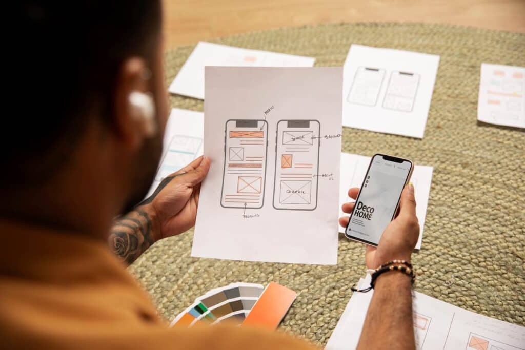
What is Mobile-First Design, Exactly?
Traditionally, web designers built sites for big desktop monitors, then made them “shrink” to fit smaller screens.
Mobile-first design flips that logic. You start by thinking: “How can I make this super easy to use on a small screen?”
Perfecting how your site looks and works on a phone or small tablet. Then, you expand or “scale up” for larger screens. This approach ensures the site is naturally optimized for the device people are likeliest to use first—their phone.
It’s kind of like preparing for a big dinner: you handle the essentials first (like the main dish) before adding side dishes and dessert. Here, the “main dish” is a smooth, simple mobile experience.
User Experience is Key
Your customers want to find your address, hours, or contact info fast—especially on the go. A mobile-first mindset means you place crucial details (like your phone number or a “Book Now” button) front and center, so it’s easy to tap.
Why Local Businesses Should Care
They’re Ready to Act
Local searches on mobile often have immediate purchase intent. Think of a traveler looking for a nearby diner or a busy parent searching for a local tutor. They want quick answers, and if your site’s easy to use on their phone, you’ve got a big advantage.
Positive Impressions = Repeat Business
A site that loads quickly and guides users smoothly to your products or service details leaves a positive impression. Even if they don’t buy right away, the experience they had can influence them to come back or recommend you to friends.
Competitive Edge
If your competitors have a clunky mobile experience, you can win those potential customers simply by offering a smoother, faster site. On the flip side, if your site’s behind the times, you risk losing people to a competitor who’s invested in a mobile-friendly approach.
Simple Ways to Go Mobile-First
Keep It Clean and Simple
Nobody likes pinching and scrolling around a tiny screen. Use big text, short paragraphs, and clear sections. Think of it like a store layout: you don’t want customers tripping over clutter to find the cash register, right?
Tips:
- Give each page a quick headline, a bit of info, and an obvious action (like “Call Us” or “See Menu”).
- Replace lengthy paragraphs with bullet points or quick, catchy statements.
Fast Loading = Happy Customers
On phones, people often deal with slower connections (think public Wi-Fi or spotty cell service). If your images are huge or your site runs slow, they’ll see a blank screen or a spinning wheel.
- Tip: Use compressed (small file size) images and a reliable hosting service. Or ask your web developer about tools that optimize your website’s speed behind the scenes.
Thumb-Friendly Buttons
Your average phone user navigates by thumb. If your buttons are too tiny or close together, they might accidentally tap the wrong thing—or just get annoyed and leave.
- Tip: Make your main button (like a “Book Appointment” or “Shop Now”) large and brightly colored so it stands out against the background.
Easy Contact Info
Local shoppers might just need your address, phone number, or hours of operation. Don’t hide these in obscure corners—feature them right on your homepage or at the top of your contact page.
• Tip: Make the phone number clickable so a tap can start a call. This is a huge help to someone on the go.
Myth-Busting: “Isn’t a Responsive Site Enough?”
Responsive design is a step in the right direction. It means your site automatically adjusts to different screen sizes. But mobile-first goes deeper—every design decision is made with the phone user as the priority. It’s like the difference between “One size fits all” and “Specifically tailored.”
With mobile-first, you’re asking: “How do we ensure the essentials are front-and-center on a phone screen?”
With responsive, you might still end up with a site that looks okay on mobile, but was built primarily for desktop in mind, so it can feel “shrunk down” or cluttered.
- Myth: “I only need a ‘responsive’ design.”
- Truth: While “responsive” is a good start (meaning the site shrinks or expands depending on screen size), mobile-first design goes deeper. It ensures the entire layout and content prioritize mobile usage from the start, rather than just adapting from a desktop blueprint.
- Myth: “I run a small local business—desktop is enough.”
- Truth: Even small businesses see a huge chunk of traffic from smartphones. Plus, local SEO relies heavily on how your site appears on mobile—Google checks your mobile version first!
- Myth: “I have a separate ‘mobile version,’ so I’m good.”
- Truth: Separate mobile versions can cause confusion (two URLs, potential mismatch in content). A single, well-optimized mobile-first site usually offers a smoother user experience.
Impact on Your Bottom Line
Let’s be real: you’re not investing in your website just for fun. You want more sales, more customers, or more bookings. A mobile-first site helps in ways that directly affect the bottom line:
Better Online Visibility: A user-friendly mobile site can help your SEO, leading more people to find your page search engines like Google.
Less Friction: Every extra step or pinch/zoom a customer has to do can cost you a sale. Making it smooth means fewer drop-offs.
Higher Credibility: A polished mobile experience signals that you’re a professional business that cares about customers’ time—potentially boosting trust and loyalty.
Quick Action Plan
- Check Your Current Site on a Phone: Open your site, try clicking through the pages. Did anything irritate you or slow you down? Make a list.
- Prioritize Critical Info: Decide what your local customers absolutely must see first (like phone, hours, or special offers). Put that front and center.
- Talk to a Web Designer: If you’re not tech-savvy, find a mobile-first design specialist or an agency that can revamp your site with these principles in mind.
- Test, Test, Test: Even after improvements, test on different phones. Ask friends or customers with iPhones and Androids for feedback.
Conclusion: Embrace the Mobile-First Mindset
In a world where everyone’s glued to their phone, Mobile-first design isn’t just a buzzword. It reflects the daily reality of how your customers find, explore, and connect with your business.
Imagine them at home, scrolling on their phone during lunch, looking for a restaurant or a boutique that meets their exact need. By making their mobile experience a top priority—clean design, fast loading, user-friendly navigation—you’re essentially welcoming them with open arms.
Making your site phone-friendly can be the difference between a sale and a miss.
So if you haven’t done a mobile check in a while (or ever), now’s the time. A few small changes—like a simplified menu or a more obvious “Call Now” button—can make a world of difference in how comfortable people feel on your site.
And comfort often translates into conversions—be it booking an appointment, adding an item to the cart, or simply giving you a call.
At Ravecode Solutions, we’re all about making sure your site isn’t just “responsive,” but truly built for the folks who open it from their phone.
So, are you ready to put mobile users first? The sooner you optimize for their small screens, the sooner you’ll see big results.
Remember: The future is mobile. Make sure your website is ready for it!